Archive
May 2nd, 2010
Is your Website optimized for horizontal attention pattern?
Jacob Nielsen Research discovered that people pay twice as such attention to the left side of the screen than to the right side:
- Left half of screen: 69% of viewing time
- Right half of screen: 30% of viewing time
As this is definitively a very useful insight for all people trying to optimize websites, there should be an easy way to utilize this information. Hence, we provide a tool to quickly check your website.
 Learn more
June 8th, 2008
Parallel Coordinates and Missing Values
This article describes how parallel coordinates can be used to get an overview over the distribution of missing values in the data.
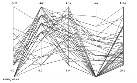
When analyzing data, it is almost always the first step to get an overview and understand the data, its properties, distribution and pitfalls. In order to achieve this, usually the data is visualized. There are several views available for this task. However, all of these views lack the support of missing values. Missing values cannot be displayed per definition, since they are missing. Nevertheless, they also provide useful information when trying to understand the data. As far as I know there are two possibilities to display missing values: histograms (pie charts) and parallel coordinates.
April 20th
Impressions of the See Conference#3
Update: Got the names of the creators of the two outstanding visualizations presented by Ben Fry.
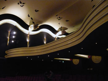
This post summarizes my impressions of the see conference #3 in Wiesbaden, Germany on April, 19th. The topic of the conference was „Visualization of Information“ (that's why I was there) and the target audience was mainly designers and design students. The speakers were intentionally selected from various domains such as design, architecture, information visualization research, and art. The location, an old cinema, was very nice:
The talks in chronological order:
- Dr. Fritz Reusswig – Researcher for climate change effects: „Climate change as design and communication challenge“
- Frank van Ham – IBM Visual Communications Lab: „Social Collaboration around Visualization“
- Ben Fry – Designer: „Visualizing Data“
- Julien De Smedt – JDS Architects: „Perception of Space“
- Zachary Lieberman – Performing Artist: „Making the Invisible Visible“
- Bruce Sterling – Science Fiction Author: „When is the Visualization Better Than the Thing“
February 27th
Tooltips for Google Chart API
As described in the article "A five dimensional scatterplot" it is only possible to display three dimensions with Google's chart API: x, y and size of the dots. In order to provide more information to the reader of the chart, tooltips are the solution at hand.
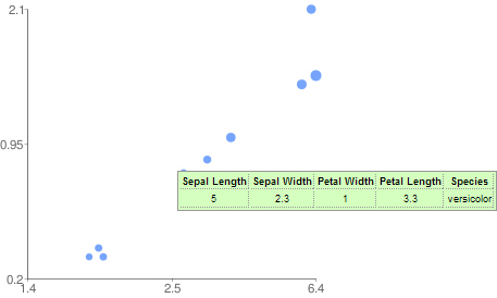
A 5-Dimensional Scatter Plot
Sometimes the concept of dimensionality in plots is misunderstood. A scatter plot can not only display two dimensions (I'm not talking about a 3D scatter plot) but up to five or more.

Dimensions in visualizations are not necessary orthogonal spatial dimensions. With visual attributes such as color, size and shape one can easily add some more dimensions to a visualization. In the following I will discuss some of the advantages and problems of such an approach.
February 10th
Travel Information Visualization
The amount of information we consume every day is continuously growing. Because of that, it is important to ease the consumption of information in everyday life. Bus and train schedules are certainly an important information - especially if you are in a foreign city and common ways of presenting this information leave room for improvement.
Thus, this article reviews some of the existing ways how bus and train schedules are presented. Some not so common approaches are shown as well. And finally, some of the better ones are redesigned.

All examples are adapted to the bus lines in Konstanz, Germany.
February 4th
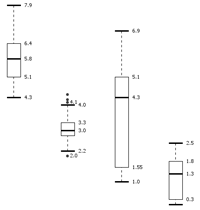
Box Plot
January 26th
Bubbles: Built with Processing
This is a completely useless processing play-around. But it looks nice, at least in my opinion. So click on the image below, lean back, watch it, and enjoy.

January 21st
Graph-based Visualization of Topic Shifts
This graph visualization is a result of a research project at the Chair for Bioinformatics and Information Mining at the University of Konstanz to investigate the visual exploration of topic shifts. If you are interested in a more detailed description about the background and methods used, you may want to have a look at the referring paper(PDF).
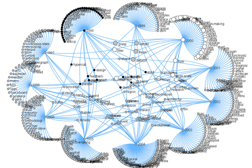
The abtracts of the IEEE SMC A, B, and C transactions from 1996 to 2006 were used as input data.
January 10th
KNIME Interactive Views
One of my responsibilities at KNIME is the design and implementation of interactive views.
KNIME, pronounced [naim], is a modular data exploration platform that allows the user to visually create data flows (often referred to as pipelines).
This article should shortly introduce the views I developed so far and some which are still under construction. I describe the following views:
each with a screenshot and how the information is displayed in each visualization.