In my opinion the box plot is one of the most underestimated views in current fashionable information visualization approaches. Modern chart libraries come with a lot of available charts but almost all of them miss the box plot. Thus, I decided to write this article to put the brilliant box plot back on the map again and provide a
CSS/Javascript solution for displaying box plots.
I checked all chart libraries mentioned in this outstanding
article of smashing magazine (and a few more) and this is what I found:
From 15 web-based charting engines only
one provides box plots. A little bit more encouraging are libraries and tools (although the listing is definitively not exhaustive): out of 8 investigated only one doesn’t come with box plots. (You'll find detailed tables at the
end of the article).
History:
The box plot goes back to John Tukey, which published in 1977 this efficient method to display robust statistics (
Tukey77).
Best Practice:
The most impressive and excellent usage of a box plot I found on the
world freedom atlas:
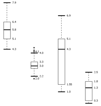
Let’s first look at the view at the top. Also here a box plot is displayed. The red dot in the blue bar is the median; the lines at the left and right represent the lower and upper quartiles (I will
explain later on what numbers a box plot actually displays); 0 and 40 are the minimal and maximal possible values.
If you move with the mouse over a country on the map, it is highlighted in the box plot as you can see in the picture above: the country with a raw political rights score of 34 (it’s Mongolia by the way).
Another very nice feature here is the stacking of elements with the observed value at the top of the blue bar. This indicates for each value how many countries have this score – and thereby providing an immediately comprehensible understanding of the underlying distribution.
But, of course, this is only possible if you have a predictable number of values to stack – otherwise you cannot determine the necessary height; and if these values are integers – otherwise you have an infinite number of possible positions for the values and a stacking is not possible.
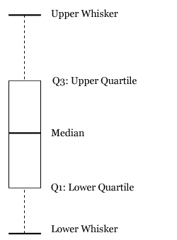
The box plot at the bottom of the above picture is as recommended by Edward Tufte (
Tufte01). Again, the red dot represents the median; the ends of the lines towards the red dot are the lower and upper quartile, respectively; the ends of the lines towards the borders are the minimum and maximum values.
Another nice feature here is the yellow line showing the development of the shown index (the raw political rights score) over the last years for the selected country (the currently selected year is displayed in darker blue). Each particular value for the selected country in each year is connected by the yellow line. As one can see immediately, it is a little decreasing.
As mentioned above this is probably the most stunning example of a box plot, everything is done correctly. Still, in my opinion, there are some drawbacks with Tufte's recommendation for box plots.
Usually, a box plot is displayed in the following way (this one was created with the data exploration tool
KNIME, where this box plot was implemented by myself):

Tufte's recommendation is based on the notion of avoiding chart junk and the principle of maximizing data ink, i.e. the ink in the drawing should be used to display data and not decoration or junk. While this is certainly a good guideline, it is sometimes difficult to read. In the example of the world freedom atlas, it is only possible to decipher the actual values by looking at the box plot to the left. By maximizing the data ink sometimes the readability is minimized.
In the example below definitively more “ink” was used, but in my opinion the essential information – the key values and their exact numbers – are immediately visible. This might not be as appealing as the box plot above, but if you are really interested in the values this version might better fit your needs. (Maybe, because I’m more familiar with it?)
Theory:
But what is this all about? What values are displayed in a box plot? What are the advantages of a box plot? The image below should at least clarify the used terms, whose meaning is explained below.
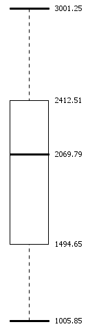
A small example should make things clear. Consider a small village with 25 inhabitants. This is what they earn and the resulting box plot:
| Citizen Nr. | Income | Key Value |
|---|
| 25 | 3,001.25 | Maximum |
| 24 | 2,996.45 |
| 23 | 2,919.35 |
| 22 | 2,787.02 |
| 21 | 2,784.72 |
| 20 | 2,696.83 |
| 19 | 2,412.51 | Q3: 0.75 * 25 = 18.75 = 19. |
| 18 | 2,400.43 |
| 17 | 2,367.84 |
| 16 | 2,333.37 |
| 15 | 2,285.53 |
| 14 | 2,214.87 |
| 13 | 2,069.79 | Median: 0.5 * 25 = 12.5 = 13. |
| 12 | 1,923.62 |
| 11 | 1,819.22 |
| 10 | 1,773.34 |
| 9 | 1,597.54 |
| 8 | 1,589.48 |
| 7 | 1,494.65 | Q1: 0.25 * 25 = 6.25 = 7. |
| 6 | 1,423.74 |
| 5 | 1,391.92 |
| 4 | 1,334.88 |
| 3 | 1,184.53 |
| 2 | 1,125.78 |
| 1 | 1,005.85 | Minimum |
As you can see, the basic idea is to sort the data and then select the minimum, the maximum and the values at the referring positions: median (0.5), lower (Q1) (0.25) and upper quartile (Q3) (0.75).
Why these values are considered to be robust statistic key values? In order to explain this, consider a similar village with one rich person and the following incomes:
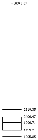
| Citizen Nr. | Income | Key Value |
|---|
| 24 | 10,345.67 | Maximum |
| 23 | 2,919.35 | Upper Bound |
| 22 | 2,787.02 |
| 21 | 2,784.72 |
| 20 | 2,696.83 |
| 19 | 2,412.51 |
| 18 | 2,400.43 | Q3: (18. + 19.)/2 = 2,406.47 |
| 17 | 2,367.84 |
| 16 | 2,333.37 |
| 15 | 2,285.53 |
| 14 | 2,214.87 |
| 13 | 2,069.79 |
| 12 | 1,923.62 | Median: (12. + 13.) / 2 = 1,996.71 |
| 11 | 1,819.22 |
| 10 | 1,773.34 |
| 9 | 1,597.54 |
| 8 | 1,589.48 |
| 7 | 1,494.65 |
| 6 | 1,423.74 | Q1: (6. + 7.) / 2 = 1,459.2 |
| 5 | 1,391.92 |
| 4 | 1,334.88 |
| 3 | 1,184.53 |
| 2 | 1,125.78 |
| 1 | 1,005.85 | Minimum / Lower Bound |
Two things are important here:
- Calculation of the quartiles (X0.25, X0.5, X0.75):
Let's consider we would have 4 values. Then the position of the median would be 4 * 0.5 = 2 which is not the the middle of four values. Actually, there is no value in the middle of four values, so we have to take the mean between the 2nd and 3rd value.
If we have 5 values, then the position of the median is 5 * 0.5 = 2.5. Then the ceiled value is 3 and the 3rd value is indeed in the middle of 5 values (2 above and 2 below).
The same holds for the other quartiles. To sum it up, the quartiles are calculated as follows:
- calculate the position
p
- check if it is an integer
- yes: take the mean between value at position
p and p+1
- no: take the value at
ceil(p)
Almost all programming languages start counting at zero, so the values don't have to be ceiled but floored to get the correct positon and if it is an integer the mean between p and p-1 has to be taken.
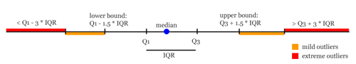
-
The horizontal bars outside of the box in the middle (called whiskers: hence the name box and whisker plot) are not always the maximum and the minimum.
The whiskers mark those values which are minimum and maximum unless these values exceed 1.5 * IQR. The IQR is the inter quartile range: the distance between Q1 and Q3. If there are observations which are outside 1.5 * IQR or even 3 * IQR then they are considered as mild and extreme outliers, respectively. The picture below depicts the concept in a qualitative way (distances are not correct):
And here the robust statistics become relevant. Let’s compare the median with the mean (the mean is the sum of all values divided by the number of values).
Robust Statistics:
In the first case we have a median of 2,069.79 and a mean of 2,037.38, so they are quite comparable.
In the second case – according to the mean of 2,303.437 – the village is richer, while the median keeps incorruptible saying the truth (1996.705) and the only rich person is displayed as what it is in this village: an outlier. The same holds for the other key values, of course.
Summary
At this point we can summarize, what a box plot actually displays.
- at least 25% of all values are below the lower quartile Q1.
- at least 50% of all values are below (or above) the median.
- at least 25% of all values are above the upper quartile Q3.
- The box contains 50% of the data (Q3 (75%) - Q1(25%) = 50%).
- You can read from the size of the box, the distance of the whiskers the distribution of the values.
- Between the median and the quartiles are 25% of the data (75% - 50% = 25% and 50% - 25% = 25%), i.e. the position of the median inside the box indicates whether there are more values towards the upper or lower quartile.
- Not to mention the outliers, which are those values, that are far away from most of the other values.
Application:
In this section we provide a JavaScript and CSS based box plot – which hopefully increases the usage of box plots.
We first start with the JavaScript to sort the numbers, then access and calculate the key values and detect the outliers. Afterwards these values are displayed with the help of CSS and by inserting elements into the DOM tree. This
example page shows how it works. If you want to use a box plot on your page you just have to import the
CSS and the
javascript and then call
createBoxPlot(dataArray, height, divID);
where
- dataArray is your numeric data as an array
- height is the desired height of the box plot
- and divID is the id of the div that contains the box plot at the end
That's it. You can position the div with divID as you like.
So far, we tested it with Firefox, Safari, Opera, and Internet Explorer 7 on Windows and Mac.
(Be sure, to have an XHTML DOCTYPE declaration in your page - otherwise it won't work with IE7). If you happen to have an Internet Explorer 6 or older, it would be nice if you could leave a short comment if it works for you as well. We would kindly assume that you have it for test purposes only ;o)
If you are using the provided box plot solution it would be nice if you could leave a comment. Simply, because we're eager to know if anyone uses it - and where.
Update: We decided to publish the script now under the
MIT license, as this seems more appropriate for software. In a nutshell: you are free to use the script - also for proprietary software - as long as you include the copyright notice "Copyright (c) 2010, Fabian Dill". And, of course, the software is provided without warranty of any kind. Have fun!
Supplements:
Web-based solutions (JavaScript, Flash, XML, PHP, .net)
Tools & Libraries (selection)
Other
A Java-based online box plot generation / simulation.
References
- Tukey77: John W. Tukey, "Exploratory Data Analysis". Addison-Wesley, Reading, MA. 1977.
- Tufte01: Edward R. Tufte, “The Visual Display of Quantitative Information”, Second Edition, Graphics Press, Cheshire, Connecticut, p. 125
Hi, I'm monk.e.boy (project
Hi, I'm monk.e.boy (project lead for open flash chart)
Should I take this as a feature request? ;-) ;-P
I will re-read your article and try to implement these so called BOX thingies ;-)
Thanks for the link, and thanks for checking out open flash chart
cheers dude :-)
monk.e.boy
Hi monk.e.boy, sorry for the
Hi monk.e.boy,
sorry for the delayed reply but we had (and probably still have) a problem with the notification about comments. Just discovered it by chance.
Nevertheless I'm happy to here of your interest. And yes, you can take it as a feature request if you like.
If you have any problems or further questions don't hesitate to write me a mail.
If you've finished leave a comment here and I will of course update the post ;o)
Best,
Fabian
You might be interested
You might be interested in:
W. A. Stock and J. T. Behrens. Box, line, and midgap plots: Effects of display characteristics on the accuracy and bias of estimates of whisker length. Journal of Educational Statistics, 16(1): 1–20, 1991.
which compares Tufte's redesign to the traditional boxplot and find it lacking.
There are techniques for
There are techniques for drawing box and whisker plots in Excel. Most provide pretty good charts, and I think my technique is among the best:
http://peltiertech.com/Excel/Charts/BoxWhisker.html
I've been working on a utility that a user will be able to point at their data, and it will generate a box and whisker plot. The boxes and whiskers are pretty easy, but efficient treatment of the outliers is rather complixated. I have an earlier attempt available for testing:
http://peltiertech.com/Excel/Zips/PTS_Box_Charter_Setup.zip
I thought I'd solved the outlier problem with this version, but after a rather small number of observations it breaks down (and slows down, especially in Excel 2007). I've been working on this and hope to have a robust new version available soon.
Jon Peltier
Peltier Technical Services, Inc.
Nice summary article. I
Nice summary article. I honestly don't know why more people don't use box-and-whisker plots. Many of my colleagues insist on using the sinister dynamit plots to show mean/variation around the mean. In most cases they should be replaced with either a dot plot or boxplot.
I think that there is a simple explanation: Excel. The simple solution: R.
@Dylan: In my certainly
@Dylan: In my certainly biased opinion KNIME would also be an alternative ;o)
KNIME views support visual variables like shape, color and size and a form of linking and brushing, such that interesting points (outliers in a box plot) could be highlighted and observed in other views (or original data tables), which is - as far as I know - not that easy in R. Correct me if I'm wrong.
A very nice and detailed
A very nice and detailed article. It helped me a lot in data analysis of gene expression experiments at the bioinformatics department at the saarland university, Germany. I only had to convert the js-css-code to c++ to handle data sets larger than 4 million observations :)
@Maher Al-Awadhi Thank you
@Maher Al-Awadhi
Thank you very much for your appreciation. I'm pleased to hear that the article helped you.
I know the problems with gene expression data handling, since I've wrote my master thesis about gene expression data analysis with frequent pattern mining ;o)
je rechercherche SVP les
je rechercherche SVP les livres sur les titres suivant :"boxplot,la visualisation de données pour le data mining,data mining"
merci
http://www.jfree.org/jfreecha
http://www.jfree.org/jfreechart/api/javadoc/org/jfree/chart/renderer/cat...
interesting article,
interesting article, bookmarked
Missing "Break" in code?
Missing "Break" in code?
Hi, is a very nice review. By the way I was wondering if there is no a break instruction missing in the Upper outliers loop just at the las conditional block (as a symmetry of what you're doing for the lower outliers loop.) Please warn me if so.
Thanks.
Missing "Break" in code?
Missing "Break" in code?
Hi, very helpful review. By the way, I was wondering if there is no a missing break instruction on the upper outliers loop at the last conditional block (as a symmetry of what you do on the lower outliers loop).
Please warn me if so, and thanks.
Sorry for the late reply -
Sorry for the late reply - but we were all extremely busy lately. However, I believe answering you question late is better than not answering it at all.
The values are sorted and the first loop starts at the smallest value and sorts them into extreme small outliers and mild small outliers. Once a value was observed which is equal to the lower whisker we know we can stop searching for small outliers since we reached the border from where on the values are not longer considered to be outliers - the lower whisker: hence the break in the loop that searches for small outliers.
When searching for the large outliers we start with the values above the upper quartile. Now every value is considered to be the upper whisker (intentionally overwriting every smaller value) until we found a value which is considered to be a mild large outlier (q3 + 1.5 * iqr). Since the values from here on only get larger we need no break but classify all of them either as mild or extreme outliers.
Of course, all this only works because the values are sorted.
Hope that answers your question?
Best,
Fabian
Excellent article. In less
Excellent article. In less than 15 minutes, I came to understand boxplots, comming from "zero" knowledge.
Hello, and thank you for this
Hello, and thank you for this article. It helps me with explaining to people about how the plots work. I was wondering if it was possible to properly scale these, and have them vertically positioned on the Y-axis relative to the values given (ex: one would be placed higher than the other because it has larger values). This would be useful for having a series of box plots, in order to compare box A to B to C. Just a suggestion to extend its usefulness. Cheers.
Hi blassster, If I understood
Hi blassster,
If I understood you right you find exactly what you need - just one single Y-axis - in the image used above:
Generated with KNIME, an open source data analytics platform.
Was that what you asked for? Best, Fabian
i am glad to see what u have
i am glad to see what u have still,but i have one question
for you,that is i need to know the advantage and dis advantage of dot plot,thank you for help.
Trying to interperet this...
Trying to interperet this... does the license allow this to be used in a commercial software/website package? Thanks. Having a slow day...heh.
Hi Drew, since the creative
Hi Drew,
since the creative commons seems to be inappropriate for software we decided to put it under the MIT license. In a nutshell this means: feel free to use it - anywhere, of course also in commercial software, websites, whatever. Just leave the copyright notice. And if you want to: leave a comment here where you used it - for our interest only.
Hope that helps?
Best regards,
Fabian
What is the significance of
What is the significance of choosing whisker points as 1.5 times interquartile range or 3times IQR. Is there any justification or theoru behind it. I would like to know the answer.
A very nice page. I think the
A very nice page. I think the effort has passed, we have to thank you:))
vb
Really neat. I would like to
Really neat.
I would like to respectfully submit an enhancement request(s)
I would like to be able to have two or more box plots side by side for comparison purposes. It would be nice to be able to specify an axis max and min value and height so that box plots could be lined up side by side.
Hi, While i execute the
Hi,
While i execute the above box plot code i am getting 'Uncaught TypeError: Cannot call method 'appendChild' of null' i.e when i call document.getElementById(divID) it is returning null. Not able to figure out as what might be the problem. Please help.
Post new comment