Impressions of the See Conference#3
Update: Got the names of the creators of the two outstanding visualizations presented by Ben Fry.
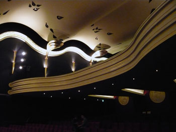
This post summarizes my impressions of the see conference #3 in Wiesbaden, Germany on April, 19th. The topic of the conference was „Visualization of Information“ (that's why I was there) and the target audience was mainly designers and design students. The speakers were intentionally selected from various domains such as design, architecture, information visualization research, and art. The location, an old cinema, was very nice:
The talks in chronological order:
- Dr. Fritz Reusswig – Researcher for climate change effects: „Climate change as design and communication challenge“
- Frank van Ham – IBM Visual Communications Lab: „Social Collaboration around Visualization“
- Ben Fry – Designer: „Visualizing Data“
- Julien De Smedt – JDS Architects: „Perception of Space“
- Zachary Lieberman – Performing Artist: „Making the Invisible Visible“
- Bruce Sterling – Science Fiction Author: „When is the Visualization Better Than the Thing“
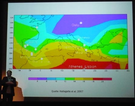
Dr. Fritz Reusswig: Climate Change as a Design and Communication Challenge
The main thesis of Dr. Fritz Reusswig was that we are currently facing a shift in the discourse about climate. In the last decades the question was if we had a climate change and whether it is human-made. It has been proven that both questions have to be answered with „Yes“. Because of that the focus changes from analysis to management (how to deal with climate change); the interest and responsibilities move from ecological sciences to politics, economy and the whole society. And what has to be visualized is not only scientific data and results, but visualization has the power and responsibility to document and support the change within the society.
As an example he mentioned the efforts of designers to make people aware of their carbon foot print.
He identified three challenges:
- to create and communicate not naive and not romantic but positive future utopia
- to create and communicate a „Low Carbon Industrial Design“
- to create with and communicate to the people a „Low Emission Lifestyle“
Although Dr. Fritz Reusswig used conventional slides with scientific visualizations he had something important to say and that made the talk very interesting and impressive – and supported his thesis that the visualization and communication of the climate change has to be done by designers.
Links to Visualization about this topic:
- http://www.vestaldesign.com/design/category/portfolio/ecodesign/
- http://www.tiffanyholmes.com/Projects/7000oakscounting/ (via Infosthetics)
- http://ecoviz.org/
- http://www.diykyoto.com/ (via Infosthetics)
Frank van Ham: Social Collaboration around Visualization
The main thesis of Frank van Ham was that information visualization is recently undergoing a change away from explorative tasks for the scientific research community towards communication and collaboration for anyone. He stated four requirements for new information visualizations:
- they should be massively collaborative (basically the internet as the platform)
- not focus on analysis but on communication
- it should be visual
- and end-user driven
Then he demonstrated many-eyes. For those who don't know many-eyes already it is certainly worth looking at it - and using it. For those who knew and used many-eyes the rest of the talk was quite... known.
The news was, that they are thinking about allowing for plug-in own visualization techniques and use many eyes to gather the data, send it to the provider of another visualization technique and then display the resulting visualization. Another thing they are working on is the integration of live data, i.e. a URL is used as a data source and the visualization is frequently updated.
Ben Fry: Visualizing Data
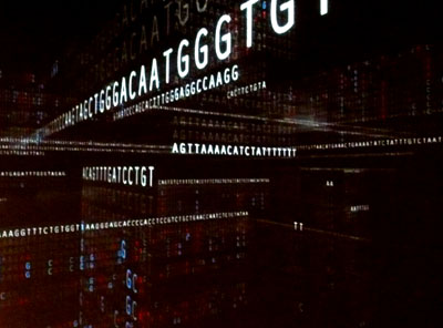
Basically, Ben Fry just showed an impressive number of projects he realized. And since all of them are really outstanding this was more than enough. He started with showing some older projects, then showed the genome browser, which he used as an example, how he always tries to shift between practical application (focusing on the information side):
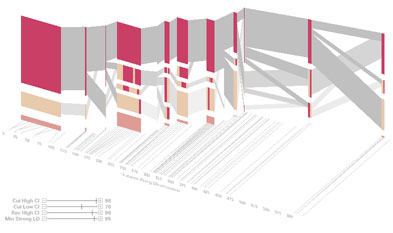
and aesthetic illustration (focusing more on the visualization side):
I don't want to list here every project he demonstrated (although each of which would be worth it). One certainly interesting thing was his current involvement in g-speak: a gesture interpreting display (known from the movie „Minority Report“), which is currently becoming reality (the display) and for which he wrote an L.A. traffic analysing visualization:
However, the most striking things for me personal (since I knew most of the presented projects already) was the work of two students of him.
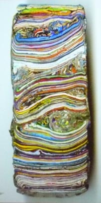
- In Cambride they have a fence which is used by the students for announcements (parties or whatever). Laurel Bancroft made a drill to cut out a piece of all the paint on the fence. This technique known from geology also here revealed a small part of history. And besides clearly telling a story (of years of student announcements, different colors and materials) it defintively looks striking good.
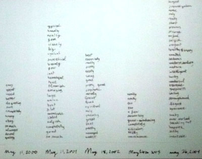
- Ayça Akin, who wrote a diary since she was a child selected one day in the year and copied all descriptive words used in this entry of the diary for this certain day. These words were stacked on a timeline over the years: from child, to teenager, to young adult.
The font, the kind, and the amount of words clearly tell a story about her life and how she grew up and became a young adult. Most impressive!
Julien De Smedt: Perception of Space
His talk was mainly about two influential elements of his design process:
diversity (nationalities in his office, geographical regions of projects, specialization of his staff, etc.)
context:
The talk of Julien De Smedt started with showing a project which was completely independent of any context. Then he showed several projects, which eventually got their form and appearance through influences from the surrounding contextual constraints, such as sunlight and neighboring houses. He had some 500 slides for 45min, I'm not an architect, so this is all I understood. Anyway, impressive and inspirational talk and visuals.
Zachary Lieberman: Making the Invisible Visible
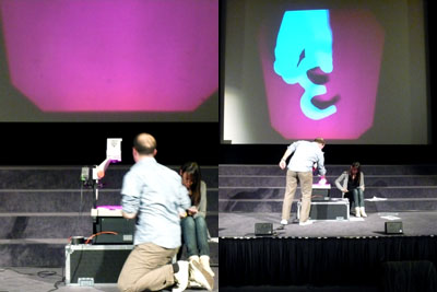
Zachary Lieberman started his talk with a live performance of his famous project "The manual input session", see video below.
Which is realized using an overhead projector:
He talked about his motivation of bringing things to life and making people open their mouth – an observation he had made during his installations, where people could draw on paper and then could manipulate a projection of the drawing. At the moment, when the kids started to manipulate the projection they were so astounded that they opened their mouth. Also part of his motivation: to create wonders!
Another interesting point was his statement about his view on his profession. He understands himself not so much as an artist but as a researcher: „artistic practice is research“. Research to understand the presence, the possible future and how people are.
Bruce Sterling: When is the Visualization Better Than the Thing
Didn't get his point at all.
Thank you very much for this
Thank you very much for this summary.
Thanks for the Visualization
Thanks for the Visualization and great conferences.
By the way, the live stream
By the way, the live stream of the conference is available online.
Thanks to Scholz & Volkmer!
Post new comment