Tooltips for Google Chart API
As described in the article "A five dimensional scatterplot" it is only possible to display three dimensions with Google's chart API: x, y and size of the dots. In order to provide more information to the reader of the chart, tooltips are the solution at hand.
These tooltips can be realized using the HTML area tag. For any image you can provide a map, which lets you specify certain mouse sensitive areas with different shapes like rectangle, circle or polygon. So this is exactly what we need in order to install tooltips to a google chart.
In order to see what information is needed a short inventory helps.
We have:
- the height and width of the target image
- the domain values that should be mapped to the target dimension
- the maximum and the minimum of the domain values
We need:
- the mapped coordinates of the domain values
The mapping of the domain values to coordinates can be achieved easily with the following mapping function:
coordinate = (value – min / max – min) * target size
which essentially maps the domain value into a range between 0 and 1 and then multiplies it with the available target image size (width or height), such that the maximal value is mapped to the maximal available coordinate. Since Google always starts the axes with 0, the mapping function gets even easier:
coordinate = (value / max) * target size
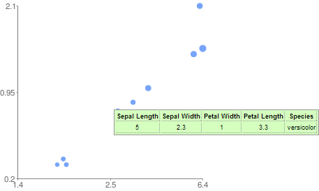
This coordinates can be used to create the map with the area tags that will be mouse sensitive. This sensitivity is used to show tooltips with detailed information about this data point as shown below.
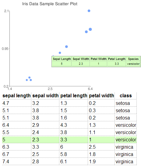
Click on the image to see the interactive version of the tooltips for Google's chart API with an example scatter plot.
The chart was created with the following parameters:
- chs (chart size):
- 300x300
- cht (chart type):
- s (scatter plot)
- chm (chart shape marker):
- 20 maximal size
- chxt (chart axis type):
- x,y (y and y axis)
- chxl (chart axis label):
- 0:|1.4|2.5|6.4|1:|0.2|0.95|2.1 (min, middle, and max values per axis)
- chtt (chart title):
- Iris+Data+Sample+Scatter+Plot
- chd (chart data):
- s: and the encoded data using simple encoded data
More information about the parameters you find on Google's chart API site.
Side note:
Saved me some more hours of desperate nightly search:
http://www.webmasterworld.com/html/3142618.htm
To make it work in IE7 the “usemap” attribute in the javascript has to be “useMap”.
Epic Systems together with
Epic Systems together with Beemode (www.beemode.com) have developed a Data Visualization software "Trend Compass" almost ready to be released soon. It is an extension to Gapminder which was invented by a Swedish Professor. You can view it :
- www.gapminder.org
It is a new concept in viewing statistics and trends in an animated way. It could be used in presentation, analysis,research, decision making, etc.
Here are some links :
- Part of what we did with some Governmental institution:
www.epicsyst.com/visual.swf
- A project we did with Princeton University on US unemployment :
www.epicsyst.com/main3.swf
- April 2008 Media Monitoring on Cars TV ads (ad duration vs occurences over time) :
www.epicsyst.com/ads/cars.swf
- Ads Monitoring on TV Sattelite Channels during April 2008. Pick Duration (Ads daily duration) vs Repeat (Ads repetition per day).
http://www.epicsyst.com/ads3/allchannels.swf
I hope you could evaluate it and give me your comments. So many ideas are there.
You can test the software by uploading data on our website and getting the corresponding Flash charts. This is for a limited number of users.
Regards.
Eng. Hisham Abdel Maguid
www.epicsyst.com
Hi, great tip! But your
Hi, great tip! But your formula only the coordinates y-axis and it doesn't take into account the graphs y-offset which it should. And you can't use it to get the coordinates x-axis value.
hi i want to show a tool on
hi i want to show a tool on graph whose url is as bellow can you please guide me out :
http://chart.apis.google.com/chart?cht=lxy&chs=340x250&chd=t:0,28|76.6,76.6|0,28|91.9,91.9|0,28|122.5,122.5|0,1,2,8,9,10,12,13,14|73.4,75,56,76,75,78,75,89,87|7,11,20,21,22|96,58,55,69,69|0,28|55,55|0,1,2,8,9,10,12,13,14|73.4,75,56,76,75,78,75,89,87|14,28|87,123.16666666667&chxt=x,y,r&chco=FF8040,00FF00,FF8042,3072F3,ff0000,ff0000,3072F3,3072F3,FF8040,00FF00,FF8042,3072F3,ff0000,ff0000,3072F3,3072F3&chls=2,2,0|2,2,0|2,2,0|2,2,0|2,2,0|2,2,0|2,2,0|2,2,2&chxl=0:|10-05|14-05|18-05|22-05|26-05|30-05|03-06|07-06|1:||66|82|98|114|130|2:||21.6|26.8|32.0|37.2|42.4&chds=0,28.0,50.0,130.0,0,28.0,50.0,130.0,0,28.0,50.0,130.0,0,28.0,50.0,130.0,0,28.0,50.0,130.0,0,28.0,50.0,130.0,0,28.0,50.0,130.0,0,28.0,50.0,130.0&chf=c,lg,90,76A4FB,0.5,FFFFFF,0|bg,s,FFFFFF&chm=t,000000,0,0,15|tHealthy,000000,1,0,15|tOverweight,000000,2,0,15|o,3072F3,3,-1,5.0|s,ff0000,4,-1,5.0|tNext%20goal,000000,5,0,15|R,FFFF00,0,0.497,0.5&chg=14.3,20,1,8
Hi, please refer to the
Hi,
please refer to the source code of the example page. The
createMap()function is probably what you are looking for. There it is defined how the tooltip is injected. Hope that helps.Best regards, Fabian
Do you have any video of
Do you have any video of that? I'd love to find out some additional information.
The above example for tooltip
The above example for tooltip in google image scatter chart is awesome, i need to put the same functionality in my image line chart, is there any code for line charts, having only one graph. If so please mail me.
Post new comment