Parallel Coordinates and Missing Values
This article describes how parallel coordinates can be used to get an overview over the distribution of missing values in the data.
When analyzing data, it is almost always the first step to get an overview and understand the data, its properties, distribution and pitfalls. In order to achieve this, usually the data is visualized. There are several views available for this task. However, all of these views lack the support of missing values. Missing values cannot be displayed per definition, since they are missing. Nevertheless, they also provide useful information when trying to understand the data. As far as I know there are two possibilities to display missing values: histograms (pie charts) and parallel coordinates.
Some histograms support missing values by displaying them in an extra bin, showing the amount of missing values in the current binning column, as in the histogram below.
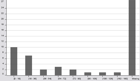
The disadvantage of this approach is that histograms display the data only for one binning column. In order to get an overview over the distribution of missing values in the data one has to select each column as a binning column to see, where the missing values are.
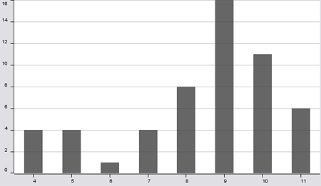
For the sake of this example, I generated a data set where each row contains either in one column missing values or in another. (Although this is a bit simplified, I had a comparable situation in a project at a customer with real data, which gave me the idea for this article). Selecting a binning column for the histogram with no missing values in the beginning, might give the impression that there are no missing values in the data:
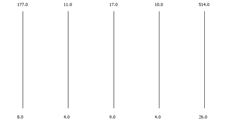
When looking at parallel coordinates with a configuration where rows with missing values are skipped leads to an empty plot, which is quite confusing when you know that the data set is of normal size:
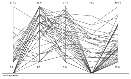
Parallel coordinates display all data in the vertical direction, the horizontal axis is used to display the dimensions. This gives the possibility to exploit the available horizontal space to introduce a third dimension outside of the normal range. Whenever a displayed row has a missing value in one dimension, the connecting line falls out of the regular space and falls onto the missing value axis.
In this way, the distribution of the data and the missing values can be explored. One can see immediately, that the missing values are in two dimensions. With the help of hiliting or linking and brushing also the data with missing values can be explored in more detail.
Another option is to skip only the missing values by interrupting the connecting line representing one row/observation. I would recommend this if there are only a few missing values and the additional missing value axis would distort the visualization too much. All interrupted lines are not distinguishable anymore, but through the sparseness it is immediately visible how many missing values are in the data.

As far as I know histograms (and pie charts) and missing values are the only possibility to visualize missing values and their distribution within the data.
Does anyone know another possibility to visualize missing values? Did anyone encounter a similar situation, where it would have been necessary to visualize missing values? Would you use parallel coordinates or do you think they are useless? Leave a comment!
Great Blog!. Reminds me of
Great Blog!.
Reminds me of an article I ran into that talks about Visualization making its way into Enterprise Software
Visualization Video
that first graph looks very
that first graph looks very much like the plotting they use for calculating and diplaying train movements over a network of stations. Just that every linecrossing would me a fatal train crash.
Sounds interesting, although
Sounds interesting, although I don't know exactly which kind of plotting do you mean. Could you link to an example?
There is also a quite similar-looking visualization of train schedules, which I mentioned in this article about travel information.
@fabian yes, you have one
@fabian
yes, you have one visualisation about train movements that i hav in mind in the other article
http://ieg.ifs.tuwien.ac.at/~aigner/teaching/infovis_ue/img/technique-im...
of course lines do cross, but only in opposite directions.
here are some more
http://www.opentrack.ch/opentrack/opentrack_d/opentrack_d.html
http://www.psrail.com/images/s21ufig4.gif
Your blog is impressive
Your blog is impressive fabian. I'll refer this to my engineering student friend.
Mike Gamer of Coin Operated Video Games
I like the fact that the bar
I like the fact that the bar graphs displayed above help to make things understandable for those of us who are visually inclined.
Absolutely fabulous! Just to
Absolutely fabulous!
Just to let you know: I will include you in my Reference List of Data Visualisation Sources on the net. Currently over 300 meta sources, it will soon grow to over a thousand. Check it out and if you miss something, I would be grateful if you left a comment. Keep up the good work!
Hi It is great!!!..Any one
Hi It is great!!!..Any one who implemented zooming lence effect for parallel coordinates.
reply
Fantastic data visualization.
Fantastic data visualization. Does anyone know where I can get more information about visualizing missing data?
Post new comment