Travel Information Visualization
The amount of information we consume every day is continuously growing. Because of that, it is important to ease the consumption of information in everyday life. Bus and train schedules are certainly an important information - especially if you are in a foreign city and common ways of presenting this information leave room for improvement.
Thus, this article reviews some of the existing ways how bus and train schedules are presented. Some not so common approaches are shown as well. And finally, some of the better ones are redesigned.

All examples are adapted to the bus lines in Konstanz, Germany.
Existing Approaches
The most common bus schedules are like the following:

If you are at a station, this schedule can be read from left to right, if you want to look for a certain bus you can read it from top to bottom.
Stem-And-Leaf Plot
Another typical kind of presentation are those at a certain station. Here the departures are vertically ordered by the hour and horizontally ordered by the minute. This kind of presentation is called stem-and-leaf plot (Tufte01). The hours are printed only once and the referring minutes are stacked:
| 05| | ||||
| 06| | 48 | |||
| 07| | 22 | 41 | 59 | |
| 08| | 21 | 36 | 51 | |
| 09| | 06 | 21 | 36 | 51 |
| 10| | 06 | 21 | 36 | 51 |
| 11| | 06 | 21 | 36 | 51 |
| 12| | 06 | 21 | 36 | 51 |
| 13| | 06 | 21 | 36 | 51 |
| 14| | 06 | 21 | 36 | 51 |
| 15| | 06 | 21 | 36 | 51 |
| 16| | 06 | 21 | 36 | 51 |
| 17| | 06 | 21 | 36 | 51 |
| 18| | 06 | 21 | 36 | 51 |
| 19| | 06 | 21 | 36 | |
| 20| | ||||
| 21| | ||||
| 22| | ||||
| 23| | ||||
| 00| |
This one reads much faster, you only have to track the current hour and then look for the next minute. But there is a disadvantage for these schedules. In Konstanz there is a station, where almost all bus lines cross. Thus, there are about 12 of these schedules and you keep searching until you find the schedule of the line you are going to take. And, even worse, if you are not interested in one particular line, since several lines go to your desired destination, then you have to compare several schedules, remember the next departure and compare it to the other ones.
A complete stem-and-leaf plot for the Station "Sternenplatz" in Konstanz (for workingdays only) is shown below. The line number is printed in brackets behind the departure time:
| 05| | 14(02) | 17(01) | 22(02) | 46(02) | 52(01) | 53(04) | ||||||||||||||||||
| 06| | 05(02) | 16(02) | 18(01) | 33(01) | 33(02) | 34(13) | 39(14) | 41(04) | 43(12) | 45(01) | 48(09) | 53(02) | ||||||||||||
| 07| | 03(12) | 04(01) | 04(13) | 08(02) | 09(14) | 11(04) | 19(01) | 22(09) | 23(02) | 23(12) | 34(01) | 34(13) | 38(02) | 39(14) | 41(04) | 41(09) | 43(12) | 49(01) | 53(02) | 59(09) | ||||
| 08| | 03(12) | 04(01) | 04(13) | 08(02) | 09(14) | 11(04) | 18(12) | 19(01) | 21(09) | 23(02) | 33(12) | 34(01) | 34(13) | 36(09) | 38(02) | 39(14) | 41(04) | 48(12) | 49(01) | 51(09) | 53(02) | |||
| 09| | 03(12) | 04(01) | 04(13) | 06(09) | 08(02) | 09(14) | 11(04) | 18(12) | 19(01) | 21(09) | 23(02) | 33(12) | 34(01) | 34(13) | 36(09) | 38(02) | 39(14) | 41(04) | 49(01) | 51(09) | 53(02) | |||
| 10| | 03(12) | 04(01) | 04(13) | 06(09) | 08(02) | 09(14) | 11(04) | 19(01) | 21(09) | 23(02) | 33(12) | 34(01) | 34(13) | 36(09) | 38(02) | 39(14) | 41(04) | 49(01) | 51(09) | 53(02) | ||||
| 11| | 03(12) | 04(01) | 04(13) | 06(09) | 08(02) | 09(14) | 11(04) | 19(01) | 21(09) | 23(02) | 33(12) | 34(01) | 34(13) | 36(09) | 38(02) | 39(14) | 41(04) | 49(01) | 51(09) | 53(02) | ||||
| 12| | 03(12) | 04(01) | 04(13) | 06(09) | 08(02) | 09(14) | 11(04) | 18(12) | 19(01) | 21(09) | 23(02) | 33(12) | 34(01) | 34(13) | 36(09) | 38(02) | 39(14) | 41(04) | 48(12) | 49(01) | 51(09) | 53(02) | ||
| 13| | 03(12) | 04(01) | 04(13) | 06(09) | 08(02) | 09(14) | 11(04) | 18(12) | 19(01) | 21(09) | 23(02) | 33(12) | 34(01) | 34(13) | 36(09) | 38(02) | 39(14) | 41(04) | 48(12) | 49(01) | 51(09) | 53(02) | ||
| 14| | 03(12) | 04(01) | 04(13) | 06(09) | 08(02) | 09(14) | 11(04) | 18(12) | 19(01) | 21(09) | 23(02) | 33(12) | 34(01) | 34(13) | 36(09) | 38(02) | 39(14) | 41(04) | 49(01) | 51(09) | 53(02) | |||
| 15| | 03(12) | 04(01) | 04(13) | 06(09) | 08(02) | 09(14) | 11(04) | 19(01) | 21(09) | 23(02) | 33(12) | 34(01) | 36(09) | 38(02) | 39(14) | 41(04) | 44(13) | 49(01) | 51(09) | 53(02) | ||||
| 16| | 03(12) | 04(01) | 06(09) | 08(02) | 09(14) | 11(04) | 18(12) | 19(01) | 21(09) | 23(02) | 26(04) | 33(12) | 34(01) | 34(13) | 36(09) | 38(02) | 39(14) | 41(04) | 48(12) | 49(01) | 51(09) | 53(02) | 56(04) | |
| 17| | 03(12) | 04(01) | 04(13) | 06(09) | 08(02) | 09(14) | 11(04) | 18(12) | 19(01) | 21(09) | 23(02) | 26(04) | 33(12) | 34(01) | 34(13) | 36(09) | 38(02) | 39(14) | 41(04) | 48(12) | 49(01) | 51(09) | 53(02) | 56(04) |
| 18| | 03(12) | 04(01) | 04(13) | 06(09) | 08(02) | 09(14) | 11(04) | 18(12) | 19(01) | 21(09) | 23(02) | 33(12) | 34(01) | 34(13) | 36(09) | 38(02) | 39(14) | 41(04) | 48(12) | 49(01) | 51(09) | 53(02) | ||
| 19| | 03(12) | 04(01) | 04(13) | 06(09) | 08(02) | 09(14) | 11(04) | 18(12) | 19(01) | 21(09) | 23(02) | 33(12) | 34(01) | 36(09) | 38(02) | 39(14) | 40(13) | 41(04) | 49(01) | 53(02) | ||||
| 20| | 03(12) | 04(01) | 08(02) | 09(14) | 12(04) | 19(01) | 23(02) | 34(01) | 38(02) | 40(13) | 49(01) | 53(02) | ||||||||||||
| 21| | 06(12) | 12(04) | 18(01) | 23(02) | 40(13) | 48(01) | 53(02) | |||||||||||||||||
| 22| | 06(12) | 12(04) | 18(01) | 23(02) | 40(13) | 48(01) | 53(02) | |||||||||||||||||
| 23| | 06(12) | 12(04) | 18(01) | 30(02) | 40(13) | 53(01) | ||||||||||||||||||
| 24| | 10(02) | 12(04) | 42(02) | 43(01) | 43(04) |
Well, obvioulsy this quickly becomes unclear.
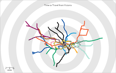
A stunning and well-arranged schedule presentation was done by stamen's. In this project they visualized train, bus and other transit type activity in San Fransisco.
The stem-and-leaf approach as well as stamen's project inspired me to re-design the bus schedule of Konstanz in the following way. Again, this is the information for a particular station in Konstanz (the "Sternenplatz" and only on workingdays). The current time is displayed and the departure times of the next 10 minutes are moving towards the current time. In this animation only the buses between 5:00pm and 6:00pm are chosen - a live schedule might be very boring between 0:00am and 5:00am (German time). The bus lines are distinguished by color.
(Click on the image to see the animation in action -> needs Java and may take some time to load).
The idea behind this display was, that if you are at a certain station you are usually interested in the buses coming in the next 10min. Of course, this doesn't replace a complete schedule (if you want to look for a bus in 2 hours, on weekend, and the like). But it could give a very quick overview of the next departures of buses.
Graphical Timetable
Another way to display train schedules was demonstrated by E.J. Marey. Here the stations are on the y-axis and the time on the x-axis. A line represents on train going from one station to another.

If you read it from left to right you see all trains arriving/leaving at one station, if you read it from top to bottom or from bottom to top you can track the trains. Another information is shown here, which is not shown (or at least not obviously) in a normal train schedule. Since the stations are placed on the y-axis proportional to their real distance, the slope of the line reveals the velocity of the train: the steeper the line, the faster the train.
I always wondered why the grid is so dense? For me it looks like visual clutter and disturbs the reading of the information. Hence, I tried a re-design of this plot and thereby adapted it to Konstanz, bus line 9.
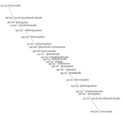
I decided to completely omit the grid. Now the information displayed is
- time: the bus goes twice every hour, minutes are written left of the line, and are displayed proportionally on horizontal x axis,
- distance: proportionally on vertical y axis,
- velocity: by the slope of the line
- density of the stations.
All information is visible at a glance since it is not distributed all over the plot but concentrated in one place.
Other Travel Related Visualizations
Tom Carden's travel time tube map
Another outstanding visualization of travel time is the Travel Time Tube Map(needs Java) of Tom Carden, which shows the London Undergound Map reorganized by the estimated travel time. If you select a station, the map reflects the travel time you need from the selected station to any other station.
Swisstrains.ch
I discovered another great approach to visualize train data. It integrates train data into GoogleMaps, such that you can track all trains in switzerland. So far, it is not based on live GPS data, but on the SBB timetable. A very cool feature is that you can click on a train and then "Follow" on the appearing menu. This will show you from a bird's eye view via satellite images, the moving train.
This is certainly a very useful application! And I'm looking forward to the further development of this service.
Vestal Design: Train Ticket Re-Design

Vestal design has made an outstanding approach to another every "travel" day aspect: the train tickets.
They made a user-centered redesign of train tickets. I would love to have such tickets instead of messing around with the ticket, the schedule and the reservations!
How to get from A to B?
An inspiring discussion about how to get from A to B can be found on "Data Mining: Text Mining, Visualization and Social Media". In this article several services are presented, which allow to get information about walk/train/bus or even bicycle combinations to a desired destination with different requirements like fastest, shortest, and the like.
Very interesting comparison
Very interesting comparison of different visualization techniques. You might think about showing them to Stadtwerke Konstanz. They might get some ideas out of it.
I also thought about this
I also thought about this (showing them to Stadtwerke Konstanz), especially because Konstanz is in the finals for the german title "Stadt der Wissenschaft", something like "Town of Science". Strangely enough ;o)
Great article and I love
Great article and I love Tufte. In case you get a chance to go, I thought German Travel Phrases and Vocuabluary was a great resource to brush up on my German.
interesting article,
interesting article, bookmarked
One thing you are omitting
One thing you are omitting with your re-design of the Graphical Timetable is that it is important for rail planners and engineers to view the entire network, not just one train.
Also, it's important to see where trains pass each other at crossing loops (where two lines intersect) on single line railways, which is what the original timetable shows.
So your re-design would have to show all lines to represent the movement of trains throughout the entire rail network, not just one line with times and stations listed. The latter wouldn't be very useful to many people and omits some of the more necessary information in managing trains.
Nice data visualization. It
Nice data visualization. It would be nice to conglomerate some of the graphs and maps into one cohesive digital dashboard!
Thanks for the visuals
Thanks for the visuals Fabian.
How about some sort of interactive map that lets end-users drill-down into schedules, etc. by area? :)
Steve from Dashboard Insight.
Post new comment