A 5-Dimensional Scatter Plot
Sometimes the concept of dimensionality in plots is misunderstood. A scatter plot can not only display two dimensions (I'm not talking about a 3D scatter plot) but up to five or more.

Dimensions in visualizations are not necessary orthogonal spatial dimensions. With visual attributes such as color, size and shape one can easily add some more dimensions to a visualization. In the following I will discuss some of the advantages and problems of such an approach.
For the examples below I use the well-known iris data set with four numerical dimensions (sepal length, sepal width, petal length, petal width) and one nominal attribute – the specific class of the referring iris plant. A small sample of the data set looks like this:
| ID | sepal length | sepal width | petal length | petal width | class |
|---|---|---|---|---|---|
| Row9 | 4.4 | 2.9 | 1.4 | 0.2 | Iris-setosa |
| Row29 | 5.2 | 3.4 | 1.4 | 0.2 | Iris-setosa |
| Row48 | 4.6 | 3.2 | 1.4 | 0.2 | Iris-setosa |
| Row52 | 6.4 | 3.2 | 4.5 | 1.5 | Iris-versicolor |
| Row60 | 5.2 | 2.7 | 3.9 | 1.4 | Iris-versicolor |
| Row81 | 5.5 | 2.4 | 3.8 | 1.1 | Iris-versicolor |
| Row126 | 7.2 | 3.2 | 6.0 | 1.8 | Iris-virginica |
| Row132 | 7.9 | 3.8 | 6.4 | 2.0 | Iris-virginica |
| Row140 | 6.9 | 3.1 | 5.4 | 2.1 | Iris-virginica |
Using a simple scatter plot to visualize the data, we immediately encounter the problem of multi-dimensionality. While the first plot shows randomly scattered points – as it seems – the second reveals a clear pattern, with a group of points in the lower left and another group in the upper right. Since only two dimensions are visible at one time, one must try out all combinations of the five dimensions to get an overview over the characteristics of the data.

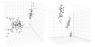
By the way, the same holds for a 3D scatter plot if the data has more than three dimensions – see 3D scatter plots below.

Although one can distinguish the two groups at a glance in the left plot is not possible to see that the larger group consists of two groups. The right plot clearly reveals the three groups - hence it depends on the correct combination of displayed columns (in this case: petal length, petal width and class).
So, let's add a visual variable to increase the number of displayed dimensions and assign three different colors to the class attribute. Now the 2D plot displays three dimensions: petal length, petal width and the class column. Adding the visual variable color to the class attribute immediately reveals a third group by dividing the group in the upper right into two groups: the green and blue one.

We could also assign the color to a numerical attribute – let's say to the petal width column. Obviously, then the plot shows redundant information: the color changes from the left (red) to the right (green), since the color is assigned to the values displayed on the x column. If a visual variable is assigned to an attribute of the data, then this attribute should not be displayed using other dimensions of the plot.

Using the same concept for the other attributes as well, the visual variables color, size and shape are assigned in the following way:
- size: sepal length
- color: sepal width
- shape: class
- x-column: petal length
- y-column: petal width
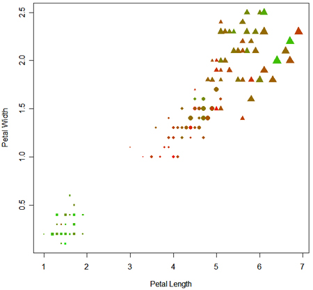
This results in a plot like this and is a 2D scatter plot displaying all 5 dimensions of the data set.

As one can see, the attributes petal length and petal width are best to distinguish the class attribute. The size and the color (representing sepal length and sepal width) are non-predictable distributed over the plot and between the different shapes, saying that it is not possible to determine the class attribute from these dimensions.
(All plots above are created with KNIME. The 3D scatter plot is still experimental though and not part of the official release).
Applications
If you want to create a five dimensional scatter plot there are some possibilities to achieve this and some of them I've tested.
Web-based charts
For a web-based solution, one might think at first of Google's chart API. Strangely enough, they do not provide the possibility for different colors and shapes in a scatter plot (only for a line plot). I'm quite curious for an explanation, why a line plot with its different colors for each line needs different shapes but not the scatter plot. Nevertheless, at least a third dimension can be displayed using the visual variable "size", as depicted below:
How the information of the remaining dimensions can be displayed with a tooltip is described in this article.
A quite nice flash-based online API is the one of amCharts, which allows the assignment of the visual variables "size" and "color". There is also the possibility to use define the shape, but as with Google's chart API only one shape per scatter plot.

Tools
In R it is possible to assign all visual variables described above to a scatter plot. The script I wrote is certainly not the best R script ever and there are probably some way more elegant solutions. The only way to assign different shapes was to add the points of the different classes successively. Anyway, if you are interested in the script you can find it
here and the result is displayed below.

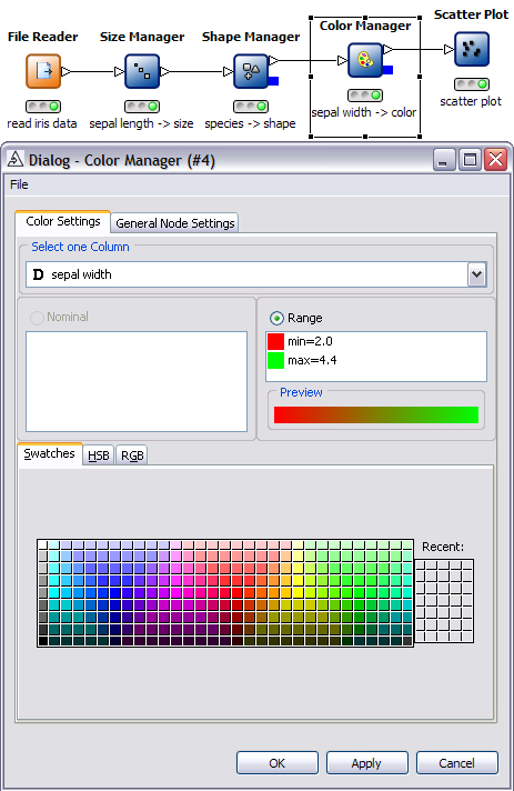
Compared to the R solution, the solution created with KNIME is quite straightforward. Simply attach the visual variables to the data table pushed through the pipeline. The screen shot below shows the KNIME flow and one example dialog to assign the color to the attribute "sepal width".

What other chart types allow
What other chart types allow you to plot using more than 3 quantitative dimensions?
Good job, thank you very
Good job, thank you very much!
Post new comment