Portfolio Fabian Dill
Statistical Views
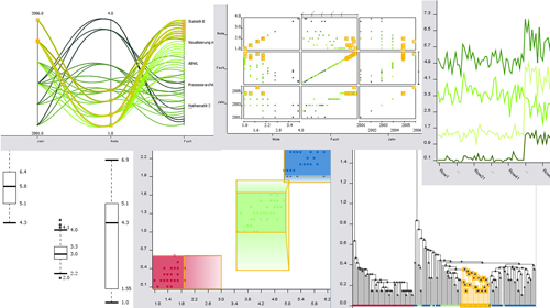
KNIME is a modular data mining platform with a focus on interactive exploration. I substantially improved this feature with a (sub-)framework realizing general visualization features. Based on this framework I implemented seven statistical views: scatter plot, scatter matrix, line plot, box plot, parallel coordinates, a dendrogram, and 2D rule plot. Almost all KNIME views are now based on this framework. See also this blog entry.
Graph Visualizations
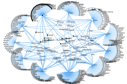
For a research project I created several graph visualizations and developed a special graph layout algorithm for the visual exploration of topic shifts. This blog entry describes it in more detail.
Visualization of Data Mining Algorithms
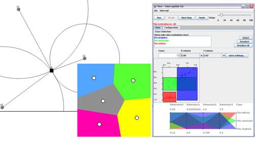
My passion for visualizing complex information and my strong interest in data mining algorithms have led to the several visualizations. An interactive visualization of genetic algorithms, an visualization showing the connection between the k-means algorithm and Voronoi tessellation, and a visualization of a fuzzy partitioning approach.
See also this blog entry.
InfoVis Contest 2005
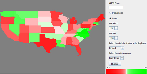
Participation at the InfoVis contest 2005. Task was to visualize U.S. high tech company data ranging from 1989 to 2003. Contribution to the IVC '05 Exploration Toolkit, which received an honorable mention.
Graphical User Interface
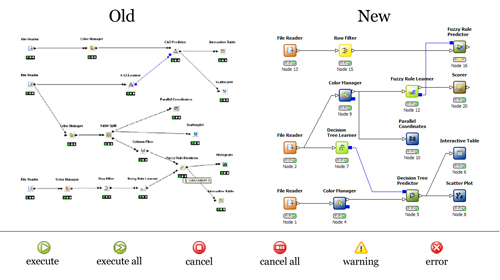
I enhanced the intuitive KNIME user interface with a new look&feel for the nodes, the traffic light showing the status of the node, and menu items. Realized with the Eclipse-based GEF framework.
Corporate Design
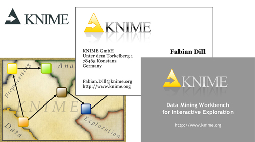
I produced the corporate design for KNIME 2.0 with a re-designed logo, flyers, presentation masters, business cards, and the like.